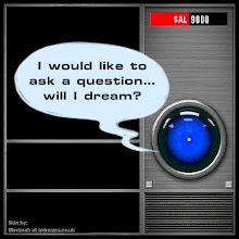
 Brought to you by poster #7, and my usual silly modifications. BTW, close-ups of the poster have been taken by the lucky owners who so kindly share their acquisitions with us, and this one has some very nice gold detailing.
Subscribe to:
Post Comments (Atom)


10 comments:
excellent.
Is this the last one? I thought there were only six. Love the colors in this one, AND the POV.
not last graphic Wayne, there are 5 or so more
Capcom, IMPRESSIVE clean mashup & great colors as Wayne said
Wayne, i'm basing the number of posters left on the question marks left, i don't know why the last question mark is in red
damoncarltonandapolarbear.com
here's another poster summary
poster madness
Tx friends!
Yes, why indeed is the last one in red?! Something special to be sure, but I hope that whatever it is, it doesn't cause even more of the greedy trough-rushing like we've seen sometimes during these poster events. But our friend Hiroki's story, along with the Argies who helped, makes up for the "bad" with the unbelievable "good" of that happy outcome for sure. Another Good vs Bad story in the saga of Lost.
:-)
and the LOST ARGSshows 6 question marks (doesn't include the initial handshake photo)including the red one, that's why i said 5 OR SO
again, VERY NICE on the seamless blue blanket
Aw thanks! :-}
Yes, we've got many more to go! I'm wondering why Jack Bender hasn't been in on the poster deal, but maybe he was busy. BTW, the Swan mural is still for sale on that site, only $25 for an unsigned/unframed one. $45 for a signed one, I think. Still cheaper than these posters by $5 on the outside cost. I might get one if I don't get moved, or lucky, in snagging one of the remaining posters in the event.
Hey capcom
Wanted to share this with you since we both weren't fans of the color scheme of the Transmission.
Hefty at Dark's site has recieved his print and post a picture, big difference than what it looks like on the site. What do you think? I like the print better in this picture.
http://www.flickr.com/photos/57903241@N00/4047182203/
My how young Linus has grown. :) Love your modifications.
Tx for the link! You're right, that is a bit different. That image also shows up some very nice boundary details between the colors that I didn't notice on the DCAAP site. Still, I would have loved that poster if it were green.
Post a Comment